
Book Formatting Guide India: Your Key Takeaways
- Choose your trim size before formatting anything else — it determines every other setting
- The inner (gutter) margin must always be wider than the outer margin to allow for binding
- Print and eBook formatting are completely different — never submit a print PDF as an eBook file or visa versa
- Front matter and back matter follow a fixed order that readers and libraries expect
- A single Quick Reference Table at the end of this guide covers all key specifications
You have finished writing your book. Now comes the step that separates a professional publication from an amateur one: formatting. Poor formatting does not just look unprofessional — it costs you readers on page one. This book formatting guide India covers every essential decision, with specific values you can apply immediately.
Step 1 — Choose Your Trim Size First
Trim size is the physical dimension of your printed book. Every formatting decision — margins, font size, line spacing — follows from this choice. Get it wrong and you may need to reformat the entire book.
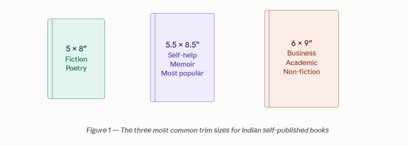
Rule of thumb: When in doubt, choose 5.5 × 8.5″. It works for almost every genre, prints efficiently on Indian presses, and looks professional on Amazon and Flipkart listings.
Step 2 — Set Your Margins Correctly
Margins are not decorative. They protect your text from disappearing into the binding and give readers’ eyes breathing room at the edges. There are four margins to set — and the inner (gutter) margin is the one most authors get wrong.
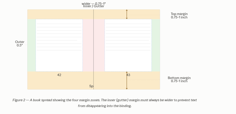
Recommended margin values for a 5.5 × 8.5″ book:
- Top: 0.75 inch (19mm)
- Bottom: 0.75 inch (19mm)
- Outer (left on right page, right on left page): 0.5 inch (13mm)
- Inner / Gutter: 0.875 inch (22mm) — must be wider than outer
Why the gutter matters: When the book is bound, some of the inner margin is consumed by the spine. If you set the inner margin too small, words near the spine will curve away and become difficult to read. For books over 300 pages, increase the gutter to 1 inch. “The number of pages in your book directly affects your minimum MRP — see our guide on how page count affects publishing cost.”
Step 3 — Fonts and Text Settings
Font choice affects how professional your book looks and how long readers stay on each page. These settings are for print books specifically.
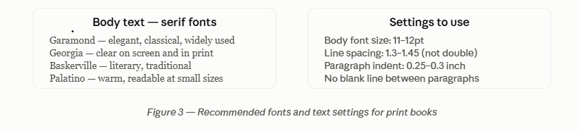
Use a serif font for body text — serifs guide the eye along each line and significantly reduce reading fatigue over long passages. Reserve sans-serif fonts (like Calibri or Arial) for headings only, if at all. Most professional Indian books use Garamond or Georgia for body text. “For a deeper guide to choosing the right font for your genre, read our complete fonts guide.”
Step 4 — Chapter Openings and Running Headers
Chapter opening pages are formatted differently from running pages. This distinction signals professionalism to any experienced reader.
- Chapter opening page: Preferably begin text one-third down the page, rather than the top margin. No running header. Page number at the bottom centre only.
- Running pages: Preferred placement for author name on left-hand pages (verso), book title or chapter name on right-hand pages (recto). Page number at the outer edge of the footer.
- Drop cap: Optional on chapter opening paragraph. If used, apply consistently to every chapter.
- First paragraph: No indent on the first paragraph of a chapter. All subsequent paragraphs are indented.
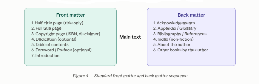
Step 5 — Front Matter and Back Matter
The pages before and after your main text follow a standard order. Departing from this order makes your book look self-produced rather than professionally published.
Step 6 — Print vs eBook: Two Different Files
This is the single most important technical distinction in book formatting, and the one most commonly confused by first-time authors.
Never submit a print-formatted PDF as your eBook file. A print PDF has fixed pages, fixed margins, and fixed font sizes. An eBook reader resizes text and reflows content dynamically — a print PDF rendered on a Kindle displays tiny unreadable text on a white page with large margins. Your eBook must be formatted separately as an EPUB or MOBI file with no fixed margins and reflowable text. Similarly, an eBook cannot be used to print copies of the book because the formatting guidelines for print books should follow the steps as listed in this blog.
The key differences: print books have fixed trim sizes, fixed margins, and page numbers that matter. eBooks have no trim size, no fixed margins, and page numbers that do not exist in the traditional sense. eBook body font size is set by the reader, not the publisher. Format them separately, always.
Quick Reference: Formatting Specifications by Book Size
| Setting | 5 × 8″ (Fiction) | 5.5 × 8.5″ (General) | 6 × 9″ (Non-fiction) |
|---|---|---|---|
| Body font size | 11pt | 11–12pt | 11–12pt |
| Line spacing | 1.3–1.4 | 1.35–1.45 | 1.3–1.4 |
| Top margin | 0.75″ | 0.75″ | 1″ |
| Bottom margin | 0.75″ | 0.75″ | 1″ |
| Inner (gutter) | 0.75″ | 0.875″ | 1″ |
| Outer margin | 0.5″ | 0.5″ | 0.625″ |
| Paragraph indent | 0.25″ | 0.25″ | 0.3″ |
| Recommended fonts | Garamond, Georgia | Garamond, Palatino | Georgia, Baskerville |
Frequently Asked Questions: Book Formatting in India
For most first-time Indian authors, 5.5 × 8.5 inches is the safest choice. It suits fiction, self-help, memoir, and most non-fiction equally well. It prints efficiently on standard Indian presses, displays attractively on Amazon India and Flipkart listings, and is the size most readers associate with a professionally produced book.
The gutter is the inner margin — the edge of each page closest to the spine. When a book is bound, some of this margin is consumed by the binding itself, causing text near the spine to curve away and become hard to read. Setting the gutter wider (typically 0.75–1 inch, larger than the outer 0.5 inch margin) compensates for this and ensures text remains fully readable in a bound book.
Yes, Word can handle basic to moderate book formatting for fiction and most non-fiction. Set your custom page size to your chosen trim size, set your margins as described in this guide, and use Word’s paragraph styles for headings, body text, and chapter titles. Word’s output is suitable for most print-on-demand platforms. For books with complex layouts, images, tables, or academic formatting, professional design software like Adobe InDesign or Atticus produces better results.
No. Double line spacing (2.0) is for manuscript submission to editors, not for published books. Published print books use line spacing of 1.3 to 1.45 times the font size. Double spacing in a published book looks amateurish and wastes pages, which increases your printing cost and your MRP.
Print formatting produces a fixed-layout PDF where every page has precise dimensions, margins, and font sizes. eBook formatting produces a reflowable file (EPUB or MOBI) where text resizes and reflows based on the reader’s device settings. They are completely separate files requiring separate production processes. Submitting a print PDF as an eBook produces an unreadable result on most devices.
The copyright page appears on the reverse of the title page and should include: the copyright symbol with year and author’s full name (© 2026 Author Name), the ISBN, the publisher’s name and address, a rights reservation statement (“All rights reserved”), a disclaimer if applicable (essential for medical, legal, or financial books), and the edition number if relevant. The Zorba Books team handles the copyright page layout as part of the publishing process. For more on copyright for Indian authors.
Font choice directly affects your page count, which directly affects your printing cost and minimum MRP. A more condensed font at the same point size fits slightly more text per page, reducing total pages. A more open font with wider letter spacing increases the page count. The difference between a well-chosen and a poorly chosen font can be 10–20 pages on a 200-page book — which meaningfully affects both your printing cost and your royalty. Use the Zorba Books Royalty Calculator to see how page count changes affect your earnings.
For a straightforward fiction or self-help book without complex layout elements, a confident author can format adequately in Microsoft Word or Reedsy’s free editor. For books with tables, images, footnotes, academic citations, complex chapter structures, or any bilingual content, professional formatting is strongly recommended. The cost of professional formatting (₹5,000–₹20,000 depending on complexity) is typically recovered through a more polished book that earns better reviews and higher sales. “For a comparison of the best free and paid formatting tools available to Indian authors.”
Related guides on Zorba Books: